Labour Chesterfield Council makes headlines for the wrong reasons
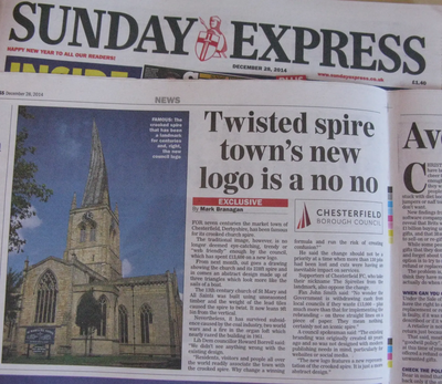
This week's Sunday Express branded Labour run Chesterfield Council's new town logo a "major branding flop".
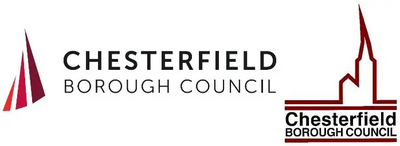
The paper rightly criticises the extravagant cost of the new logo - at £13,600 (and that just to design it, much more will be spent putting it on council property) and the design itself, as it does not seem to bear much relevance to Chesterfield and looks, "more like the sails of a boat".
Local Liberal Democrats agree with these criticisms and have repeatedly made these points throughout the process, but Labour were determined to push the redesign through. Lib-Dem Cllr Howard Borrell is quoted in the article as saying, "We didn't see anything wrong with the existing design. Residents, visitors and people all over the world readily associate the town with the crooked spire. Why change a winning formula and run the risk of creating confusion?"
Cllr Ray Russell (Lib-Dem Council Group Leader) voted against Labour's plans and reminds us that, "Chesterfield's Labour Council bosses seem to have a problem with the crooked spire logo. A couple of years ago they totally missed it off the new town boundary signs which they had just unnecessarily spent over £10,000 of residents' money on. But, following a public outcry, they then spent more residents' money having the spire put onto the signs."
Chesterfield should be making headlines at this time of year for the right reasons; for example, when the Liberal Democrats were in charge the Christmas lights in the town centre were something that drew people in from long distances to spend money in local shops, but this year's effort was very, very poor. Rather than spend money on erasing the town's history they should focus totally on promoting its future.
What do you think? Please let us know here.
Below - Original Sunday Express article and the Old and New Logos

